Painting walls and ceiling entire apartment
Kategorier:
- Vardagsrum
- Sovrum
- Kök
- Hall
Lister/dörrar/fönster : S- 0500-N
Entire apartment, wall and trim is painted in S-0500N, (klassick vit). We do not want to redo the moulding, windows etc, but can not decide the wall color and ceiling. One color for entire apartment, as the living room,kitchen and hallway basically one flowing space. ( maybe bedroom a different color)The Klassick Vit looks gray in the far end of apartment where there is less light as does the ceiling. We mainly have walnut furniture, a cherry center table, brown and gold Oriental rug, and a beige sofa. So blues and grays not good. Any suggestions for a light soft color that will be ok with the Klassick White trim ( not letting it get grey)and window frames,etc?. And should the ceiling remain the Klassick white as well? Or an even brighter white? What Jotun paints best!???
Svar från kulörrådgivaren:
Hello,
I’d be happy to help, but if you could upload a floor plan it would be brilliant. That would help me see how the rooms connect.
Please provide that, along with the color code for your kitchen cabinet doors or, alternatively, a photo where the color is clearly visible.
See you back soon😊

Kommentar
Hi Annika Tack!! Here is the floor plan. It's 85 sq. meters. The kitchen is against the wall although we will be adding a wood kitchen island . It is white, although looks a bit grey. The front hall area, you can see is dark and doesnt get direct sunshine. Maybe it needs its own color. The livingroom has morning sun. The apartment has high ceilings and big windows . Hope that helps! I am not a fan of beige, and although I was a bit against grey I love the last photo which is a Jotun ad for the Klassick Vit with Jotun 1024 Timeless! Beautiful! can I do that? Thanks do much !!!
Svar från kulörrådgivaren:
Hi
Please have a look at 1376 FROSTRÖK, 1928 SOMMARSNÖ or 1622 REFLEKTION for the walls in kitchen/liviningroom. 1024 TIDLÖS is nice but usually turns grey-greenish with S0500-N.
Test the colours on large sheets of paper that you can move around the room to see how the colors appear in different lighting and in various locations. Compare them with adjacent rooms, kitchen cabinets, countertops, flooring, and so on, to get a sense of how the colors harmonize with your existing color scheme. Let me know how you feel about the colours in your home and I will help you with hallway and bedroom.
For a super-matte, exclusive look on your walls, we recommend LADY Pure Color—our absolute matte-est paint. It creates a deep, beautiful aesthetic with a completely matte, reflection-free surface.
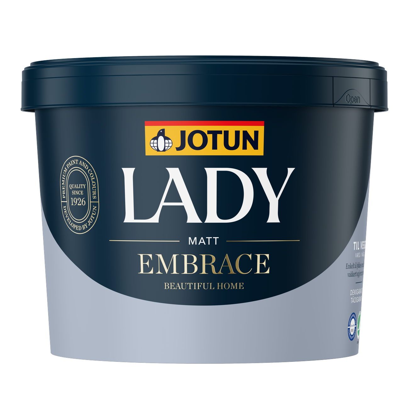
LADY Embrace is a great choice for simpler rooms and projects; it delivers beautiful, matte walls with excellent coverage and is easy to apply.
For beautiful, matte, and durable walls, LADY New Era is an excellent option. It provides a lovely, matte, and robust finish that is highly durable, stain-resistant, and washable—an ideal choice when you want to combine an elegant look with high resilience.
When you don’t want to compromise, we recommend LADY Iconic—the best of both worlds. It is a robust wall paint with exceptional durability and stain resistance, developed to withstand the rigors of everyday life. At the same time, it delivers a beautiful, luxurious, and completely matte finish, making it the perfect choice for areas like hallways, kitchens, and other spaces where walls are subject to significant wear and tear.
Welcome back😊
Du behöver:
Hitta Jotun-återförsäljare 
Vår vackraste väggfärg någonsin – supermatt
- Supermatt, exklusivt utseende
- Unik kulörupplevelse
- Slitstark
- Täckgaranti

Vacker, matt och robust.
- Vackert, matt utseende som håller
- Mycket slitstark, fläckavvisande och tvättbar
- Innehåller återvunnet material med lägre koldioxidavtryck*
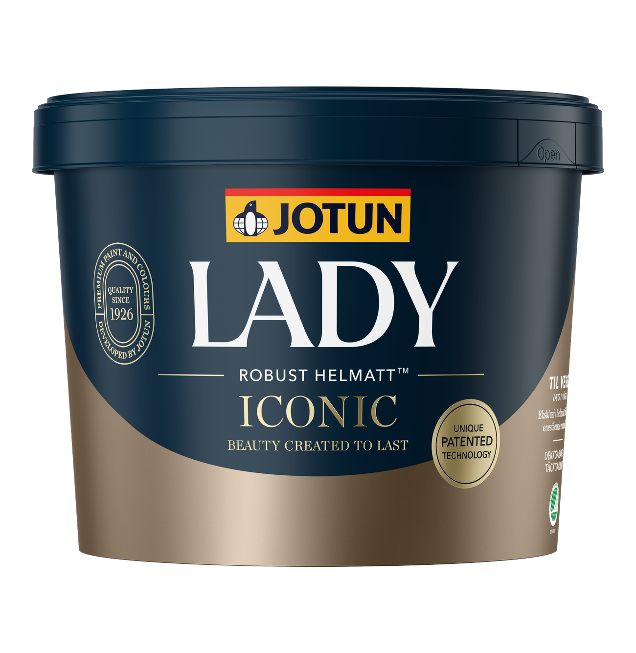
Helmatt elegans - vår mest robusta färg.
- Helmatt exklusiv finish
- Unik patenterad teknologi (Patentnr: EP3741814)
- Extrem slitstyrka, fläckavvisning och tvättbarhet
- Motståndskraftig mot märken från möbler, väskor och skor
Kommentar
Hi Annika, Thank you! I was concerned about the green effect of Timeless. Will look at the colors you suggested. What about the ceiling.Do I repaint in Klassick Vit? And what type of ceiling paint? It looks dull and worn thats why I want to repaint. The trim, molding and windows seem fine. Tack!!!!!
Svar från kulörrådgivaren:
Hi,
The best approach is to paint everything intended to be white—walls, ceilings, windows, doors, and woodwork—in the exact same shade of white. This ensures a consistent, unified white look. If you mix different shades of white, they tend to accentuate their differences; for instance, warmer whites can appear yellower than they actually are when placed next to stark, cool whites—which, in turn, may take on a bluish tint.
So, if your woodwork, window etc are in S0500-N, paint the ceiling in the same white, 9918 KLASSISK VIT.
Wooden details such as paneling/paneled ceilings, moldings, windows, doors, frames, kitchen cabinets, and furniture should be painted with LADY Supreme Finish. It is available in the following sheen levels: Pure Matt 03, Silkematt 15, Halvblank 40, and Superblank 80.
Smooth ceilings should be painted with LADY Perfection.
Good luck😊
Kommentar
Thank you Annika! My last consideration is the kitchen cabinets. As they are white, but more grey than Klassik White Im concerned how any of these colors work with them. I dont know if anything beige like looks good with then. They are a bit shiney and will change the polished crome knobs to one's with less shine. What do you think TACK!!!!
Svar från kulörrådgivaren:
Hello,
If I look closely your kitchen cabinets look as if they are in a warmer white.
Can you paint them?
Kommentar
Yes they are a warmer white. No not possible to paint!
Svar från kulörrådgivaren:
Hi
If you have both warmer white and crispy white on your white details it is better to chose at color that is a little darker. Please look at 12313 SOFT DUNES, 11363 NOSTALGIC WHISPER, 12075 SOOTHING BEIGE, 12123 CONTEMPORARY WHITE or 1563 MÖRK STRAND.
Test the colors again and let med know how you think about them and I will help you further.
Welcome back😊
Kommentar
Hi Annika, I tried all around and like Frostruck and looks good everywhere except next to in the kitchen ..it turns the cabinets beige and it all looks washed out and boring in that area! It really is a difficult thing because of the open kitchen/livingroom !
Svar från kulörrådgivaren:
Hi
Yes, that's what happens. How did you experienced the other colours that I suggested? They are a little darker. By adding a darker and a little more intense colour you create a contrast between the surfaces and it usually makes you think less of the different white hues, even if there still exist😉